Some interesting long term stock charts in this article:
http://www.zerohedge.com/news/2013-07-07/guest-post-bubble-so-big-we-cant-even-see-it
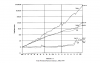
The first surprise came when comparing the S&P500 to the Consumer Price Index over the last century - since what really tells you whether the stock market is "performing well" is not just whether it's rising, but whether it's rising faster than consumer prices. Figure 1 shows the S&P500 and the US CPI from the same common date-1890—until today.
In contrast to house prices, there are good reasons to expect stock prices to rise faster than consumer prices (two of which are the reinvestment of retained earnings, and the existence of firms like Microsoft and Berkshire Hathaway that don't pay dividends at all). I therefore expected to see a sustained divergence over time, with of course periods of booms and crashes in stock prices.
Figure 1: The S&P 500 and the CPI from 1890 till today

That wasn't what the data revealed at all. Instead, there was a period from 1890 till 1950 where there was no sustained divergence, while almost all of the growth of share prices relative to consumer prices appeared to have occurred since 1980. Figure 2 illustrates this by showing the ratio of the S&P500 to the CPI - starting from 1890 when the ratio is set to 1. The result shocked me - even though I'm a dyed in the wool cynic about the stock market. The divergence between stock prices and consumer prices, which virtually everyone (me included) has come to regard as the normal state of affairs, began in earnest only in 1982.
http://www.zerohedge.com/news/2013-07-07/guest-post-bubble-so-big-we-cant-even-see-it