
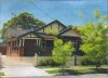
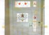
well - here is the new project. red brick with return verandah, built around the 1930's, polished timber floors, cast iron fireplaces and lovely stained glass windows (example below).
i'm in a head screw about the interior paint colours and am after some opinions - i've already choosen the exterior colours for the trims and it is definately NOT cream, green and red.
internally the current wall colour throughout is a horrible yellow with deep cream skirtings/door/window surrounds etc. i've tested the paint and there doesn't appear to be any lead based paints in the house (yay!!).
the rooms have 12 foot ornate ceilings, picture rails, very wide skirting boards and wide door/window surrounds - although the rooms themselves aren't huge (good size but not huge) and not a great amount of light comes into the rooms due to the main windows being stained glass.
the modern take seems to be painting the timberwork, doors, above the picture rails and ceilings in white and the walls in dark colour (blue or charcol, etc). the pictures i've seen of this colour scheme look very nice and freshly up to date but i'm not convienced that it wouldn't make the rooms seem smaller and darker in real life.
the other alternative is to take the timberwork and doors back to timber and paint the rest of the walls an off white.
i'd appreciate thoughts - it's a hard decision because i like both options but both are wildly different in finish and approach. i am not after the "easier" option as we are living in this house and time is not of the essence.
Attachments
Last edited:
")