Hi All,
We'd be doing an overall internal renovation on an IP. Could I please ask for what colour scheme you usually use? We prefer neutral colour scheme that can last long (not get dirty easily). IP is in Orange NSW, ex-housing area, so nothing flashy.
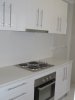
We usually use colour scheme below, but thought I'd look around for other ideas too.
Wall - hogs bristle 1/2
Ceiling - white USA
Wooden trim - white USA
Carpet - riviera mocha
Kitchen cabinet - shiny white
Kitchen bench top - dark brownish stone-like
Thank you")
We'd be doing an overall internal renovation on an IP. Could I please ask for what colour scheme you usually use? We prefer neutral colour scheme that can last long (not get dirty easily). IP is in Orange NSW, ex-housing area, so nothing flashy.
We usually use colour scheme below, but thought I'd look around for other ideas too.
Wall - hogs bristle 1/2
Ceiling - white USA
Wooden trim - white USA
Carpet - riviera mocha
Kitchen cabinet - shiny white
Kitchen bench top - dark brownish stone-like
Thank you