Good charts Shadow. Affordability has been discussed at great length over at the AP forum. That RBA chart is very revealing and shows that affordability was worse during much of the 2000's, especially 2007/8, and for quite a few years around 1989/90.And if interest rates fall (as expected by the futures market)...?
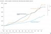
Here's another chart. Taking interest rates out of the picture, it looks like the price/income ratio has been generally improving since 2003...

PS: so far, I have managed to survive 'untrolled' today, but I'm still on the lookout for them!
As you have shown, the ABS has published survey results which show that households have been spending a fairly constant proportion of their income on housing costs since 1994/5, even in 2007/8. Well, interest rates have fallen since then and incomes have risen strongly so it can't be less affordable now than then.
Some look to the position of FHBs when assessing affordability but a thread on APF has shown that, according to the latest ABS data, the average FHB gets a loan of 2.3 times income. That doesn't sound unaffordable to me. When looking at price income ratios we need to bear in mind that FHB households earn quite a bit more than average households and its always been this way as far as the data can tell us. An old productivity commission report came up with the same message. FHBs also naturally purchase below average/median properties. Again, that's how it has always been.
Anyhow, I'm surprised to see a doom and gloom merchant here on a property investment site preaching 30% price falls, advising selling property, advising investment in a useless and earth scarring metal, and calling others trolls. Digging up more gold just to lock it up in a vault will do wonders for the world.
Anyway, this is a good site and I read it a lot. I post more on APF (under another ID) because it has a wide range of posters, not just PIs, and there is almost no moderation, which I like. Cheers.
")