Shadow,
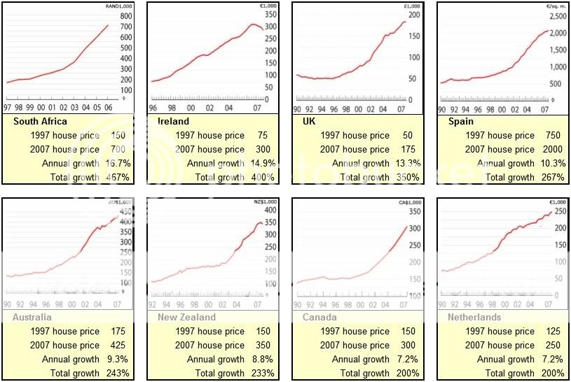
You mention you emigrated from Ireland. Can you show us a graph of what is happening to house prices in Ireland right now ? Perhaps this can help us understand what is happening here today. I understand that Ireland house prices have declined 40% in one year and they are expecting it ill eventually crack 60%. I would love to see a graph of it.
Sure, no problem! Irish house prices quadrupled in the same 10 years that prices in Australia only doubled (see below). They have since fallen about 10% from the peak. Not sure where you are getting your 40% figure from but it's way off the mark!